Why Some Products Feel Different:
Psychology, Cognition, and the Hidden Foundations of Product Design

Two products do the same thing, but one feels effortless and the other feels like work. The difference isn't features or aesthetics: it's how they interact with human psychology, cognition, and behavior. This essay explores the hidden foundations: the frameworks that determine whether someone takes action, comes back tomorrow, and why the same interface can feel completely different to different people. Let's start with the most fundamental question: what makes someone act at all?
1. Foundation: The Four Forces That Determine Action
Every action a person takes or doesn't take comes down to four factors working together:
Motivation × Ability × Identity × Context
Think of these as dials on a mixing board. All four need to be turned up enough for the song to play. And here's what makes this tricky: "enough" is different for everyone.
BJ Fogg's work on behavior taught us that Motivation and Ability drive action.
I've extended this to include Identity and Context: factors that determine whether those first two even matter. Remove any one of these four, and the action doesn't happen.
Motivation: The Why Behind the Action
Motivation isn't one thing: it's a spectrum of reasons people move.
Consider two people approaching the same task:
User A: "I need to file my taxes." (External pressure, deadline looming, consequences if ignored)
User B: "I want to learn design tools." (Internal curiosity, no deadline, self-directed exploration)
Same word "motivation" but completely different emotional states.
User A is running from pain.
User B is running toward pleasure.
Your interface needs to work for both, but what works for one might repel the other.
Urgency signals? User A responds. User B feels manipulated.
Open-ended exploration? User B thrives. User A feels lost.
Ability: The Can Behind the Action
Can the person actually do the thing? "Can they" depends on who they are:
A developer sees a terminal prompt and feels at home
A designer sees that same prompt and feels locked out
A mobile user on 3G can't load your image-heavy checkout
A desktop user on fiber doesn't notice loading time
Same interface. Wildly different ability.
Here's what matters: high motivation cannot overcome impossible ability.
When ability hits zero, motivation becomes irrelevant.
Identity: The Who Behind the Action
Identity isn't about demographics. It's about self-concept: the story someone tells themselves about who they are.
Someone who thinks "I'm technical" sees GitHub's complexity as a feature.
The learning curve signals quality. Simplification feels like dumbing down.Someone who thinks "I'm creative" sees Figma's abstraction as liberating.
The layers and components feel like infinite possibility, not overwhelming options.
Same complexity. Opposite reactions.
Your interface doesn't just need to match their skills. It needs to match their self-story. When there's friction between "this is who I am" and "this is who this product thinks I am" people leave.
Context: The Where and When Behind the Action
Context shapes everything that comes before it.
The same person, same task, different contexts:
Filing a workplace CV: Formal, high-stakes, manual precision matters.
They'll spend twenty minutes perfecting a single bullet point because consequences are real.Autofilled job application: Speed matters, perfection doesn't.
They'll submit with typos because volume matters more than polish.
Same person. Completely different behavior because the context changed.
The Universal Truth: Alignment is Everything
All four factors must align. Not perfectly but enough.
High motivation can't overcome impossible ability. Perfect ability means nothing without motivation. Identity and context modulate both by amplifying or dampening the other factors.
The best interfaces make all four align effortlessly. The worst make you fight against them.
2. From Isolated Behavior to Habit Formation
Single actions don't matter. What matters is whether someone comes back tomorrow, and the next day, and the day after that.
Sustained behavior also known as habits are built through reinforcement.
Two dominant approaches, each with different psychological foundations:
Approach A: Social Reinforcement (Think Strava)

The mechanism: Public accountability, status signaling, community validation
The loop: You exercise → You share → Your friends respond → Dopamine hits → You want to repeat
Why it works: We're social primates. For hundreds of thousands of years, group belonging determined survival. When you post your run and friends cheer, you're getting tribal validation. Your brain reads this as "the group values my contribution" and rewards you accordingly.
Strengths: Taps into evolutionary drives. Feels collaborative, not coercive.
Creates genuine community bonds.
Weaknesses: Requires an existing social network. Can trigger comparison anxiety (everyone's running marathons while you're doing 3Ks). Feels performative if the community isn't authentic.
Approach B: Loss Aversion (Think Duolingo)
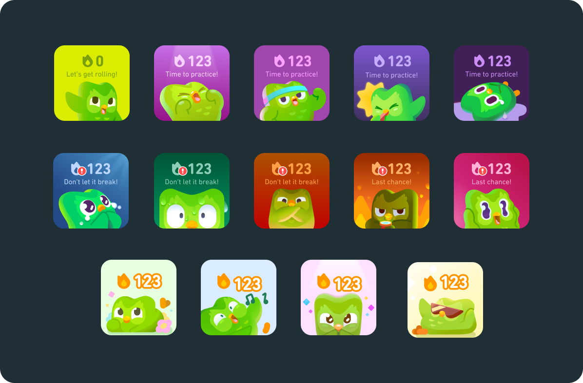
The mechanism: Streak preservation, FOMO, guilt and shame triggers
The loop: You miss a day → Your streak dies → You feel bad → You overcompensate tomorrow → Anxiety slowly builds
Why it works: Loss aversion is one of the most powerful psychological forces we have. Kahneman and Tversky's research demonstrated that losses are psychologically about twice as powerful as gains, losing $100 feels worse than gaining $100 feels good.
When you've got a 90-day streak, missing a day doesn't just mean you didn't practice: it means you lost 90 days of progress. That hurts.
Strengths: Works in complete isolation. Creates daily urgency. Doesn't require social infrastructure.
Weaknesses: Negative reinforcement exhausts people over time. Eventually, the notification isn't encouragement: it's harassment.
My Experience With Both
Duolingo worked for me initially. Every day, that little green owl reminded me, and I'd do my lesson. The streak felt like progress, tangible proof I was learning. Around day 30, I felt proud. Around day 60, committed.
Around day 90, something flipped.
The notification wasn't encouragement anymore. It was harassment. I wasn't opening the app because I wanted to learn Spanish. I was opening it because I was terrified of losing my streak.
I wasn't learning. I was avoiding punishment.

One day I just... didn't open it. The streak died.
And you know what? I felt relieved. That's when I knew the loop had broken.
Contrary, Strava feels fundamentally different.
When I run, I'm not escaping loss. I'm joining something. When I post a run and friends comment, it's not about preserving a streak. It's about sharing effort, comparing notes, cheering each other on. The social element makes the effort feel less like obligation and more like participation.
The Pattern That Emerges
Anxiety-based loops create short-term compliance but long-term resentment.
Social loops create sustainable engagement because humans are tribal animals.
We're wired for belonging, not for fear.
This doesn't mean loss aversion is always bad or social reinforcement is always good. Context matters. But if your engagement loop depends on making people afraid of losing something, you're building a time bomb. Eventually, the relief of escaping outweighs the pain of losing.
3. Visual Density and Emotional Response: Amazon vs. Trendyol
Information density seems purely aesthetic until you realize it's about psychology.
More information on screen = better comparison shopping but higher cognitive load.
Less information = cleaner interface but more clicks to make decisions.
Neither approach is objectively better. They serve different purposes. Let me show you two extremes.
Trendyol: Maximum Density Strategy

Multiple products per row, each with competing colors. Flash sale timers everywhere. Discount badges stacked on rating badges stacked on "best seller" badges. Every pixel fighting for your attention.
The goal: Maximize items seen per browsing session → increase impulse purchases
Who it works for: Bargain hunters scanning for deals. Price-sensitive shoppers comparing dozens of options simultaneously. People who expect visual noise as a signal of "lots of deals happening here."
The strategy: Cognitive overload isn't a bug: it's the feature. When you're overwhelmed by choices, your decision-making shifts from careful evaluation to heuristic shortcuts. "That one has a red badge and a timer must be a good deal."
Psychologist Barry Schwartz's research on the "paradox of choice" showed that too many options actually decrease satisfaction and increase decision paralysis. The cognitive load of evaluation becomes too high.

Amazon: Familiar Hierarchy

Fewer products per view, consistent spacing, muted color palette, clear typography. Same layout you saw in 2015. Same layout you'll probably see in 2027.
The goal: Reduce decision fatigue, build trust through predictability
Who it works for: Intent-driven shoppers who know what they want. People who value efficiency over discovery. Users who trust the ranking algorithm.
The strategy: Cognitive ease through familiarity. Your brain doesn't have to work hard because it's seen this pattern hundreds of times. That mental energy gets redirected to evaluating products, not navigating the site.

My Visceral Reaction
Trendyol's product pages feel like a neon-soaked casino at 3am. Neon assault. Visual noise. Everything screaming for attention at maximum volume. I feel nauseous browsing it. Not metaphorically—literally nauseous. My eyes don't know where to focus, my brain can't process the competing urgency signals, and I feel my stress response activating.
I go there only when I must. Search for what I need, buy it, leave. Zero pleasure. It's purely utilitarian—and even then, it feels like work.
Amazon's interface is dated. It looks like it was designed by engineers in 2008 and hasn't been meaningfully updated since. But there's something trustworthy about that datedness.
It doesn't try to manipulate me with flashing urgency. I can browse without feeling like a slot machine is pulling my attention in twelve directions. When I'm bored, I sometimes just... explore. Search for camping gear I don't need. Read reviews. I actually go there to browse, not just to transact.
The Uncomfortable Truth
Here's what makes this complicated: commercial success ≠ good experience.
Trendyol dominates Turkish e-commerce. Winning by every business metric.
And simultaneously, many users feel like they need a shower after browsing.
That's not a contradiction. That's a choice.
Anxiety converts. FOMO drives purchases. Cognitive overload triggers impulse buying. These strategies work: they measurably increase revenue. But they don't build affection. They don't create loyalty beyond price. And they certainly don't create experiences people enjoy.
The question isn't "which design is better?"
The question is "what are you optimizing for, and at what cost?"
4. Total Human Load: The Real Cost of Interaction
Good design minimizes the total energy a person has to spend. Not just mental energy, all of it.
Every interaction with a digital interface extracts a tax. Sometimes that tax is paid in thinking (cognitive load). Sometimes it's paid in worrying (emotional load). Sometimes it's paid in vigilance (trust load).
Great design minimizes the total tax. Poor design piles all three on simultaneously and wonders why people abandon.
The Framework: Three Types of Load
This builds on John Sweller's Cognitive Load Theory, which demonstrated that familiarity reduces mental effort. Sweller focused on cognitive processing during learning, but I've found that interfaces tax users in two additional dimensions that compound with cognitive load: emotional energy and trust evaluation.
Cognitive Load: Mental effort required to understand and use the interface
High load: Novel patterns you've never seen, dense information competing for attention, functionality hidden behind unclear icons
Low load: Familiar patterns your brain recognizes instantly, clear visual hierarchy, options visible without hunting
Emotional Load: Psychological energy spent managing feelings during the interaction
High load: Fear of making mistakes, anxiety about decisions, uncertainty about what happens next
Low load: Confidence that mistakes are reversible, clear understanding of consequences, emotional safety throughout
Trust Load: Energy spent verifying safety and evaluating risk
High load: Unfamiliar vendor, unclear return policies, hidden costs revealed at checkout
Low load: Established reputation, transparent pricing, clear guarantees visible upfront
These aren't independent: they interact and compound in fascinating ways.
How the Three Loads Interact

Progress bars reduce emotional load by eliminating uncertainty. You know it's working and how long you'll wait. That emotional calm reduces cognitive load too, your brain isn't burning cycles on "should I reload?"

Confirmation dialogs reduce emotional load by catching mistakes before they're permanent. But they increase cognitive load by adding a decision step. The net effect depends on consequence severity. Confirming "delete all my photos"? Worth it. Confirming "mark this email as read"? Annoying.
Familiar patterns create multiplicative effects. When you use patterns people know—hamburger menu, shopping cart icon, red "x" for close, you reduce cognitive load because recognition is easier than learning. Nielsen Norman Group research shows that users spend 80% of their time on other websites, meaning they expect your interface to work like everything else they already know. That reduced cognitive load also reduces trust load because familiarity signals safety.
Our brains evolved to trust the known and fear the unknown. And when both cognitive and trust loads drop, emotional load drops too. You feel confident navigating because you're on familiar ground.
Real Scenarios: Where Loads Compound
First-time checkout at an unknown site:
High trust load: "Is this site even legitimate? Will they steal my credit card?"
High cognitive load: "Where are the shipping costs? What's the return policy?
Why do they need my phone number?"High emotional load: "I'm anxious about fraud, frustrated by hidden information, and uncertain if I should proceed"
Result: Abandoned cart. The Baymard Institute found that 17% of online shoppers abandon carts due to concerns about payment security, a direct measure of trust load exceeding tolerance. The total load exceeded what the person was willing to pay.
Amazon one-click ordering:
Near-zero cognitive load: Single button, no forms, no decisions
Near-zero trust load: You've bought here dozens of times
Low emotional load: You know their return policy
Result: Conversion. The barrier between thinking and buying essentially disappears.
The Strategic Implication
You can't eliminate all three loads simultaneously. But you can be strategic about which loads you introduce.
Life-or-death decisions (medical, financial): Accept high cognitive load to reduce emotional load.
Use extreme clarity, multiple confirmations, detailed explanations.
Low-stakes exploration (browsing, discovering): Minimize cognitive load even if it means more clicks.
Let people flow without thinking hard.
First-time interactions (onboarding, unfamiliar vendors): Prioritize trust load reduction above everything. Show social proof, display guarantees prominently. Until trust is established, nothing else matters.
The worst experiences pile all three loads simultaneously:
unfamiliar patterns you have to learn (cognitive)
irreversible consequences you worry about (emotional)
unknown vendor you have to evaluate (trust).
That's not just bad design. That's design that's hostile to humans.
5. Perception: There Is No Single Reality
The reality you perceive isn't the reality someone else perceives. Not metaphorically, literally.
Your visual system, cognitive filters, cultural background, and personal history actively construct what you experience as "reality." Someone standing right next to you, looking at the exact same interface, is experiencing something meaningfully different.

Physical Variance: Different Hardware
Our biological hardware varies.
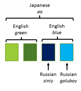
Color perception isn't universal. Russian speakers distinguish between light blue (goluboy) and dark blue (siniy) with the same automaticity that English speakers distinguish blue from green. They literally see those colors as more different. Brain scans confirm different neural activation patterns.
Vision varies wildly. Some people navigate low-light interfaces easily. Others need more light—the same interface that feels comfortably dim to one person is frustratingly dark to another.
Hearing ranges differ. An alert sound inaudible to you might be annoying to someone else. As we age, we lose high-frequency hearing first Interface sounds young designers hear perfectly are literally inaudible to “senior” users.
This isn't just about accommodating disabilities—it's the baseline fact that human perceptual systems vary, and what's clear to you might be invisible to someone else.
Cultural Filters: Different Software
Colors carry cultural meaning. Red means danger in Western contexts. In China, it means luck and prosperity. Same color, opposite emotional valence.

Personal space expectations vary by culture and shape how interfaces feel. Dense layouts feel energizing in some cultures and overwhelming in others.
Urgency cues read differently across contexts. Americans see flashing "limited time offer" badges and think "marketing tactic." In some markets, those same signals read as genuine scarcity information.
Experiential Priors: Different Training Data
And finally, personal history shapes perception.
A developer and a designer look at the same screen and see different things. The developer sees code structure and technical architecture. The designer sees visual hierarchy and emotional tone.

Someone with accessibility needs sees barriers others don't notice. A missing alt tag, low contrast button, or broken screen reader support—invisible to most users, completely blocking to others.
Past trauma shapes what feels safe. Someone who's been phished sees every unfamiliar email as a threat. Someone who's lost data sees every "are you sure?" confirmation as necessary, while someone without that history sees annoying friction.
The Implication for Design
When you design for "the user," you're designing for a fiction. There is no universal user.
Every person brings:
Their own perceptual apparatus (different biological hardware)
Their own cultural filters (different learned interpretations)
Their own experiential history (different accumulated priors)
Good design acknowledges this and makes a strategic choice:
Option 1: Adapt. Build localization, accessibility features, personalization. Most inclusive, most expensive.
Option 2: Optimize for the largest cluster. Design for the biggest group with similar needs. Accept that some people will be excluded. Most products do this implicitly, better to do it consciously.
Option 3: Stay minimal. Fewer assumptions, simpler patterns, more universal conventions. Fewer design opinions means fewer opportunities for mismatch. This isn't about being boring—it's about being humble about how little you know about each user's reality.
What doesn't work: Pretending everyone sees what you see. Designing for yourself and calling it "user-centered."
Designers love to talk about empathy. But empathy without cognition is blind. Feeling what users feel isn't enough if you don't understand why they feel it—or what structures in your interface caused it. Real design maturity comes from modeling the psychological systems that produce emotion, not just responding to emotion itself.
6. Design is Context-Dependent: When the Same Principles Produce Opposite Results
Everything I've told you has exceptions. Not because the principles are wrong, but because context fundamentally shapes what "good design" means.
Let me show you with two radically different approaches to the same challenge: getting people to take action.
Case Study: NHS Digital vs. E-commerce

NHS Digital:
Calm typography, abundant white space
Zero urgency cues, no countdown timers
Single, obvious action per page
No emotional manipulation
Why this works: People arrive anxious about health decisions, already carrying high emotional load. The interface deliberately reduces every other load through cognitive simplicity, trust signals, and emotional calm. The design creates space to focus on the actually important decision: their health.
Trendyol (Turkish E-commerce):
Dense product grids with competing visual elements
Flash sale timers counting down
Urgency badges: "Only 3 left!" "23 people viewing this!"
FOMO triggers everywhere
Why this "works" commercially: Bargain hunters expect this chaos. Visual density signals deals. FOMO triggers drive conversion. That countdown timer makes you buy now instead of comparison shopping. The business model rewards impulsive transactions over considered purchases.
The Uncomfortable Tension
NHS's calm approach would fail in e-commerce. Without urgency cues, conversion rates drop. Shoppers interpret minimalism as "limited inventory" or "expensive."
Trendyol's anxiety-inducing density would be catastrophic for healthcare.
Imagine: "BOOK BRAIN CANCER APPOINTMENT NOW—ONLY 3 SLOTS LEFT!"
Medical decisions made under artificial time pressure are worse decisions.
Can We Optimize for Conversion Without Anxiety?
This isn't solved. The current e-commerce playbook—scarcity signals, urgency cues, FOMO triggers—works because it exploits psychological vulnerabilities.
What we know: Commercial success ≠ user wellbeing. Trendyol wins on revenue while losing on experience quality. That's not a contradiction, it's a choice.
When designers claim they're "just giving users what they want". That's not true. Users don't want anxiety. They've been trained to respond to it. There's a difference.
Using These Frameworks
These aren't philosophical concepts, they're decision-making tools.
When Defining Your Audience
Don't ask: "Who is my user?" (Demographics)
Ask instead:
What's their motivation? (Running from pain or toward pleasure?)
What's their ability? (Mobile on 3G or desktop on fiber?)
What's their identity? ("I'm technical" vs. "I'm creative")
What's their context? (High-stakes decision or casual browsing?)
Result: You segment by behavior and psychology, not by age and job title. You build for actual human variance instead of fictional personas.
When Making Design Decisions
For first-time users on unfamiliar platforms:
Prioritize: Trust load reduction (social proof, guarantees, transparency)
Accept: Higher cognitive load (more explanation, more steps)
Why: Until trust is established, nothing else matters
For high-stakes, irreversible decisions:
Prioritize: Emotional load reduction (clear consequences, reversibility, safety)
Accept: High cognitive load (detailed information, multiple confirmations)
Why: Stakes justify mental effort
For low-stakes exploration:
Prioritize: Cognitive load reduction (familiar patterns, minimal clicks)
Accept: More steps (ease over efficiency)
Why: Flow matters more than speed
For repeat users in established trust:
Prioritize: Speed (reduce all loads simultaneously)
Accept: Less explanation (assume knowledge)
Why: Trust and familiarity already established
When Choosing Your Optimization Target

Use the decision tree. You're choosing one of three paths:
Conversion-first:
You'll use urgency, scarcity, FOMO
You'll win on revenue
You'll lose on user affection and trust
Know this. Own it. Don't pretend you're optimizing for wellbeing.
Trust-first:
You'll use transparency, clear policies, social proof
You'll win on loyalty and retention
You'll lose on immediate conversion
Know this. Own it. Don't pretend short-term revenue doesn't matter.
Wellbeing-first:
You'll reduce cognitive and emotional load
You'll win on user satisfaction and sustainable engagement
You'll lose on conversion intensity
Know this. Own it. Don't pretend optimization doesn't matter.
The goal isn't to choose "the right path"—it's to choose consciously and acknowledge the trade-offs.
When Understanding Why Users Behave Differently
If a feature works for some users but not others, check:
Physical variance:
Are color choices visible to colorblind users?
Are audio cues audible across age ranges?
Are touch targets accessible on different devices?
Cultural variance:
Do visual metaphors translate across cultures?
Does information density match cultural expectations?
Do urgency signals read as helpful or manipulative?
Experiential variance:
Does this pattern match what users know from other apps?
Are people with past negative experiences seeing threats?
Are developers and designers seeing the same thing?
Result: You stop asking "why don't users get it?" and start asking "which users, with which backgrounds, in which contexts?"
The Bottom Line
These frameworks don't tell you what to build.
They tell you what you're actually building beneath the surface.
When you add a countdown timer, you're not "creating urgency".
You're choosing to increase emotional load to drive conversion while reducing trust.
When you simplify to one button, you're not "making it easy".
You're choosing to reduce cognitive load for experienced users while increasing trust load for new users.
When you add social features, you're not "building community"
You're choosing social reinforcement over isolation, which works for some people and alienates others.
Every choice has consequences. Every interface serves some users and frustrates others.
The question isn't "which design is better?"
The question is "who am I optimizing for, what am I optimizing for, and am I honest about the trade-offs?"
These frameworks help you answer that question.


